Featured

Group Demo
Get an inside look into the YourMembership software platform.
Join YM for a 15-minute demo to learn how to save staff time with an all-in-one member management system.
Your association works hard to recruit, engage, and retain members. But with a small staff, it can be easy to overlook a simple yet fundamental tool for attracting and engaging members: your website.
Think about it: Your website has only a few seconds to attract a visitor’s interest, make a good impression, and provide a great experience. Is it doing all it could be doing in that short period of time?
Consider these benefits of creating a modern, well-designed website:
So, what does a modern website look like? Here’s a checklist for a website design that will help you convert prospects to members and keep your current members happy.
Provide a great mobile experience.
We’ve all developed expectations through great experiences with websites of leading for-profit companies. Your members now expect the same type of experience from your association – with a mobile-responsive site that give them access anytime, anywhere. If you aren’t thinking about your members’ mobile experience, you could lose their attention almost as quickly as you get it.
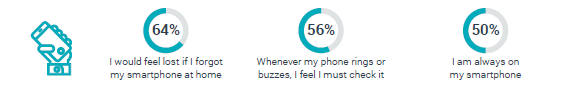
In fact the Community Brands Digital Evolution Study confirms that, like most of us, members rely on their mobile devices.
MEMBER ATTITUDES AND VALUES ABOUT TECHNOLOGY
(AGREE/STRONGLY AGREE)
A key element of a great mobile experience is a mobile responsive website. This means the site content and design automatically and intuitively change to fit the device on which the site is displayed.
Make navigation clear and simple.
Navigation is a cornerstone of usability. It doesn’t matter how good your site is if visitors can’t find their way around it. Your site navigation should use:
The simplest possible structure.
Options that are self-evident to the visitor. The same names for things in multiple places. For example: A call to action and a menu item directing a visitor to the same place should have the same name.
Use effective calls to action.
Your website must direct prospects and members to take your desired course of action. It informs their behavior while on your site. Ultimately, it helps them find what they are looking for.
Effective calls to action draw people through your site to interact, or literally take an action, such as completing a membership application. Whether you present calls to action as buttons, banners, boxes, or icons, keep these things in mind:
Use best practices for visual design.
Your website should incorporate modern best practices to make it easy for your site visitors to scan your content and interact with your site. Some considerations include:
These are just a few critically important things to keep in mind. There are many other elements to consider when designing a website centered around your visitor.
Take your website design to the next level (no matter how small your association may be).
With a small staff, your association may hesitate to take on a website redesign. That’s not unusual: The Community Brands Benchmark Report on Small-Staff Associations indicates that small associations have an overall lack of technology preparedness to meet member needs and expectations.
But that doesn’t mean you have to live with an outdated website. The YourMembership design team can help you create a modern website that helps you attract and engage members.


Bottom of page subscribe button
This will close in 0 seconds


