
Let Your Data Drive Your Product Design
Building new tools for your members? Don't be afraid to derive inspiration from your current offerings. You might find your users relying on your platforms in ways your association never intended—and that knowledge could be a boon when designing future products.
Perhaps the worst problem an organization can have with its technology offerings is something I’d like to call the Q-tip problem.
Here’s what that problem is, in a nutshell: What if you had a product that was immensely successful essentially because everyone was using it the wrong way? This sounds weird, but Q-tip maker Unilever has been dealing with this very issue for decades.
As The Washington Post explained in my favorite article of the past week, cotton swabs on sticks were essentially invented as tools for baby care, eventually going into wider general use. But most people tend to use Q-tips and knockoff products to clean out their ears, despite the fact that the Q-tip packaging specifically recommends not to use them in that way. The reason for this, as any doctor will tell you, is that the devices tend to be a major cause of ear infections or other ear-canal problems.
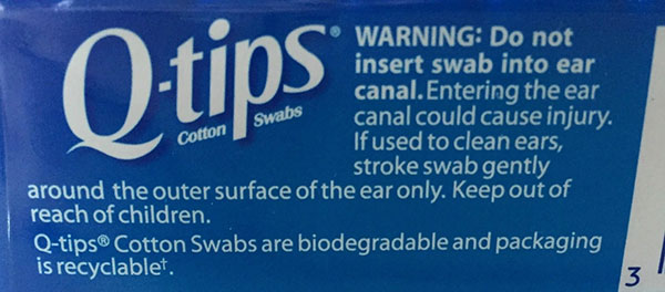
“Using Q-tips leads to what dermatologists refer to as the itch-scratch cycle, a self-perpetuating addiction of sorts,” writer Roberto A. Ferdman explained in his piece. “The more you use them, the more your ears itch; and the more your ears itch, the more you use them.”
If you were Unilever, what would you do about a situation like this—where a clearly successful product was being used in a way you never intended? In Unilever’s case, the financial success of the product, and the fact that it spent more than $2 billion acquiring the brand in 1986, meant it couldn’t take it off the market, so the company launched a campaign to tell people never to put Q-tips directly in their ears. (That hasn’t really been much of a success, as you might imagine.)
Scratch That Itch
But, for associations, generally the product in this situation—say, a website where the most popular content is deeply buried within the site, or an online community where the forums are ignored in favor of an unmoderated chat app that came as part of a larger package—is malleable enough that you can rework things as needed.
The secret here, of course, comes down to researching your audience and matching the product to their wants and needs. The reason why Unilever and the company’s prior owner, Chesebrough-Pond, were caught off guard by the unwanted success of Q-tips as a ear-cleaner is that the company’s founders early on didn’t do much in the way of market research to hint that this might be a desired use. The Q-tip was basically a tool without a set use, and its success allowed the market to decide its preferred use of the tool.
The real solution here, if you think about it, should have been the creation of an ear-cleaning product that does the job better than Q-tips—one that takes advantage of the clear market interest for such a tool. But that has never happened, and hence we’re still sticking swabs in our ears despite being told that we shouldn’t.
We know a lot more about product design now than we did in the 1920s, so we should take advantage of the data available to us in improving our offerings.
Don’t Be Like MySpace
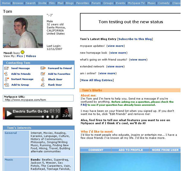
Thinking in slightly more modern terms, it’s worth considering the fate of the original version of MySpace. You might remember that standard MySpace design looked pretty ugly back in the day, kind of like this:
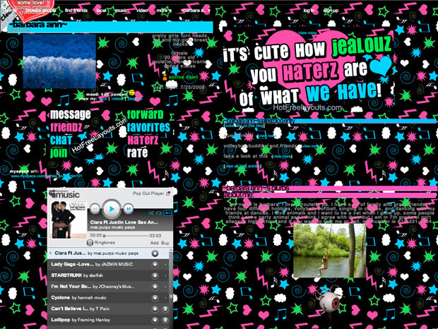
That led a lot of users to attempt to make it less ugly. Some users tried to snazz it up, but weren’t up to the task, so the results ended up looking a bit rough:
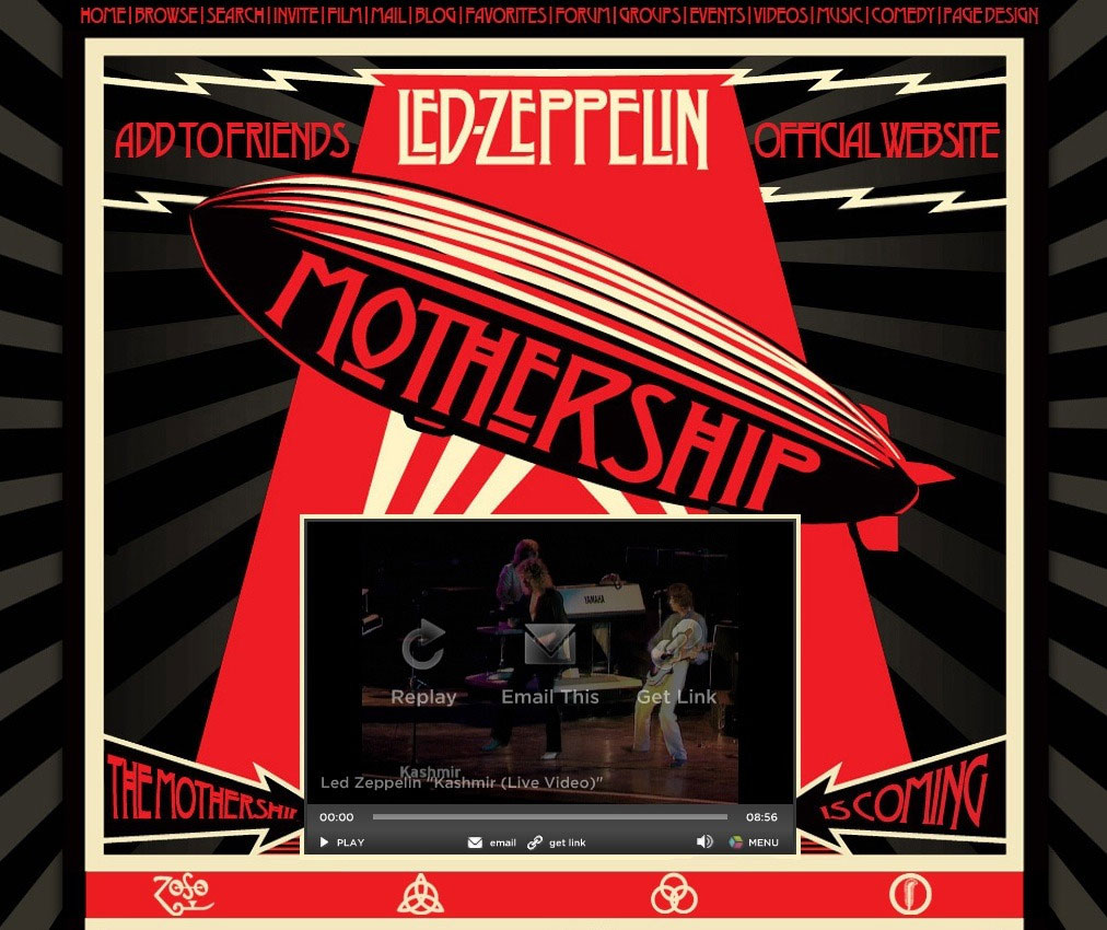
But occasionally those with something to promote—such as musicians, a huge use case for MySpace—went out of their way to do impressive things with their pages, like this:
The thing that allowed these sorts of designs on the original version of MySpace could best be called a “happy accident.” Basically, MySpace allowed users to install their own Cascading Style Sheets (CSS), which let anyone with a tiny bit of technical knowledge modify the look of their pages. It wasn’t exactly the service’s original intention, but users liked it, so Tom Anderson and company rolled with it.
The company should have found a happy medium in which it allowed slick customization for power users and marketers while not allowing changes so over the top that it made the site inconsistent and difficult to use. Alas, it never found that balance; the company decided to put its advertising needs out front, which slowly turned that advantage into a flaw.
Other social networks, such as Facebook and Twitter, saw the errors of this approach and balanced the need for self-expression with the need for design consistency. And there’s even a modern social network that effectively followed through on the MySpace idea by executing it in a way that actually didn’t stink: the blogging platform Tumblr.
Responsive Product Design
Like the Q-tips saga, custom CSS was an example of MySpace’s users using a product in a way that was never intended. In both cases, the decision drove success but hurt the perception of the products among end users.
But for your association it doesn’t have to be that way. When you’re building a webapp or technology product for your members and you see them using it in an interesting way, your goal shouldn’t automatically be to rein them in. Rather, you should reconsider how to better integrate such an approach into the app, or even create a separate product that better meets their needs.
What if, for example, that unmoderated chat room that I pointed out earlier gave way to an association-sanctioned version of Slack that your members could take advantage of as a benefit? Or what if, instead of burying the content that seems to be driving so much member interest, you gave that material its own microsite?
Your consumer-facing technology decisions should be driven by data, so don’t be afraid to dig into your analytics tool of choice and see if there might be some bigger lessons hiding in those data points.
The Q-tip is a great example of a product that many people use incorrectly. (iStock/Thinkstock)
Ernie Smith is a former senior editor for Associations Now. MORE
Got an article tip for us? Contact us and let us know!


Comments