10 Quick Tips for Improving Your Association Website Experience
Why conduct usability/user experience (UX) research on your website? Is that even worth your time and effort?
Yes! Sandy Marsico of digital creative agency Sandstorm leads usability studies with associations to uncover ways they can make their websites more user-friendly. The results? Increased conversions, a better understanding of members’ tasks and goals while visiting a website, a more robust idea of the kind of content members want (and in what form), reduced cart or site abandonment, and overall improved member engagement.
UX research doesn’t require huge focus groups, either. Marsico and her team have discovered that you only need five to six users to identify 80% of usability issues with a website or app. There are diminishing research returns after studying the way six people use the same site because humans are remarkably similar in their browsing and website use habits.
Here’s what they’ve learned from more than 3,400 hours of usability research, as presented at ASAE’s 2020 Technology Education Conference:
10 Tips for Improving Your Association Website from 3,400+ Hours of UX Research
Tip #1: Humans want things instantly.
Fifty percent of website visitors will hit refresh if a page takes longer than three seconds to load. Websites don’t have loading bars. If a page is slow, the visitor doesn’t know how long the wait will be – it could take 15 milliseconds, or 15 minutes. But only 15% of websites load faster than three seconds. Google recommends a page load speed of five seconds or less. But we know people will leave after just three seconds! So, do page load tests to see where your association’s website rates, and fix your site accordingly.
Takeaway: Improve the speed of your site to improve user experience. Members perceive “fast” as “easy to use.”
Tip #2: Users don’t read. They scan your content.
Because of the speed of technology, our minds are changing. We’re creating new circuits for scanning info. You don’t need to be a prolific writer to create content that matches the speed of online readers. Write content in a way that makes prolific use of headlines, subheads, images, bullet points, numerical lists, and supporting text. Here’s a great example of a site that hosts tons of content but makes it scannable.
Takeaway: Write scannable content.
Tip #3: Humans like to share content even when they don’t read it!
We’re all guilty of sharing an article without fully reading it, or a video without watching it all the way through. The less time you read something, the more likely you are to share it! Infographics and lists are the most-shared pieces of content. Why? They are scannable, visual, and informative. Rely on these types of content to convey important information that engages members.
Takeaway: Focus on making a strong headline. Include your social sharing options upfront (at the top).
Tip #4: Users value consistency.
The American Medical Association created social sharing options for their JAMA Network online. But the icons they used to allow readers to add an article to their interest list, as well as to evaluate published research weren’t in line with how those same icons are used on major social networks like Facebook. Users want features that correspond across websites or platforms so they can pick up a new platform, application or website functionality quickly. Remember, fast is considered easy! You want to be considered intuitive.
![]()
Takeaway: Use established UX patterns for common website tasks.
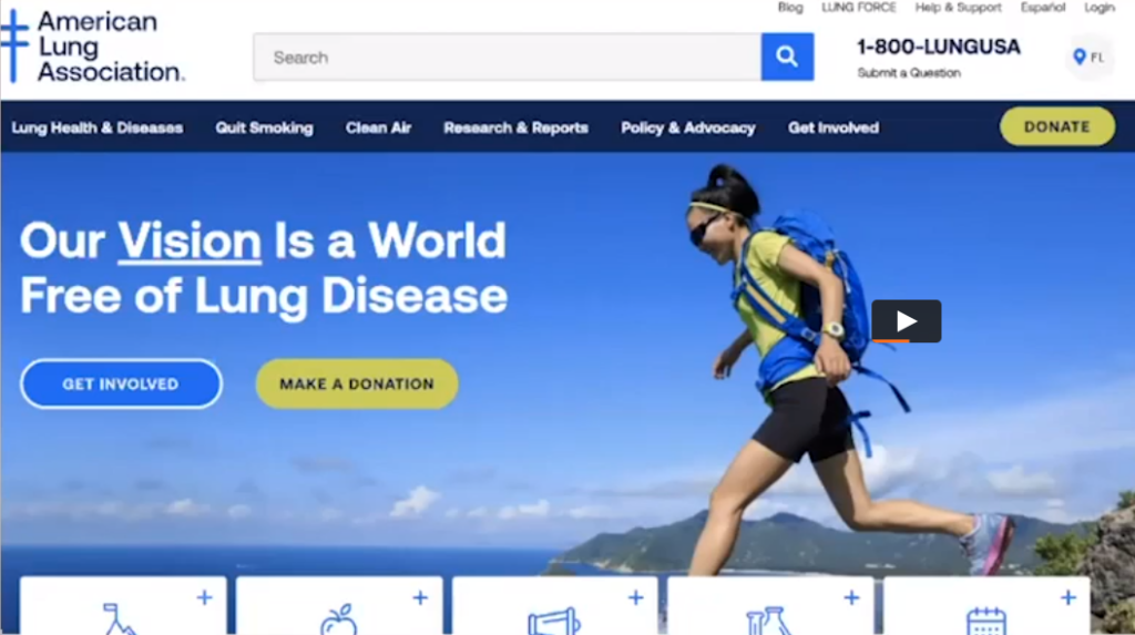
Tip #5: Users think your rotating homepage images are ads.
If you have a rotating homepage images, your users don’t comprehend the message because they think it’s an ad. And they ignore it. Plus, most rotating banners move too quickly for a visitor to read them. By automatically rotating content, you’re making your users work harder by making them follow your content at your pace. These carousels cause banner blindness. Users will scroll on desktop if you give them a reason. (Everyone scrolls on a phone.)
Takeaway: Do a small redesign of your homepage or use personalization tech to customize your homepage.
Tip #6: Website users will scroll on desktop if you give them a reason.
If you create a homepage with a large banner that doesn’t rotate, great. But if there’s no content visible beneath the “fold,” without scrolling, people aren’t as likely to scroll. Good UX home pages with large pictures have buttons to click through for more info, but also the words: “Scroll Down” so users know how to find more information.
You can have great design and great UX. If you don’t like the words “Scroll Down,” use a small page flip graphic and a phrase such as “See What’s New” at the bottom of your visible home page area to visually tell visitors that there’s more below the fold. Or, use text boxes that intentionally straddle the visible and non-visible part of your home screen to indicate there is more content if the user scrolls down a bit.
Takeaway: Beware of false bottoms: The visual limitation that big images create when they take up the entire visible part of your homepage.
Tip #7: Many users struggle with contrast.
Light text on a light background can be hard to read. Use a high contrast mode that gives your website visitors the option to view certain text blocks on your site.
Use a Contrast Checker like WebAIM.org to see if your website passes accessibility standards.
Takeaway: Sometimes color alone may be what’s standing between you and a great UX.
Tip #8: Users can tell when you prioritize your goals over theirs.
They believe you have their best interests in mind, but they can tell when you’re not making things easy. Use icons, stars, taglines such as “Most Popular” or “Best Seller” next to items or programs you want to highlight. Help your users know where to look and where to click. Put information they tell you is important to them on your homepage in a way that is easy to find. Put other important info front and center on subpages as appropriate. Never bait and switch on your users through links.
Takeaway: Transparency builds trust. Don’t be deceptive.
Tip #9: Users recognize stock photography as being fake and unrealistic.
Your members can recognize stock photography when they see it, and they often think it’s unrealistic. This doesn’t mean you shouldn’t use stock photography at all, but you should accept and acknowledge that they know it’s stock. At the same time, recognize that your association is about membership and community. Be aware of your photo choices: What types of people are in them? What do they look like? What are they doing in the photo? Do their looks and actions accurately represent your members?
Balance the use of stock photography with member-generated photos on your About Us and Membership pages. It’s very important for these website pages in particular to display real photos of actual members because these pages are supposed to be about your membership! Invest in a professional photographer for all or some of your events so you have outstanding images to show off on your website. If a member or two enjoys photography for a hobby, ask if they would be willing to take photos and share them with your association. There are many ways to obtain real photos of your membership for your association’s website.
Takeaway: Users want to see real images of their peers in the About Us and Membership section.
Tip #10: We’re all consumers: There is no B2B in UX.
Poach ideas off consumer websites you like! For example, the presenter took Wayfair’s product filtering functionality and look and applied it to a massive course catalog that the National Business Institute offers, to help members find relevant courses faster. Another example: Taking the Domino’s Pizza tracker and applying it, even as a static image, to progress in having membership applications or event registrations processed. Use this image in emails or snail mail to members.
Takeaway: Use B2B functions in your association.
Look up and out of the association and nonprofit industry to solve UX problems. B2B consumers like your members are really just consumers! Take these 10 association website tips and apply them to your website.
