Tech Time-Wasters: Are Too Many Apps Really the Problem?
A recent study makes the case that users spend too much time switching between applications. But that diagnosis might cloud the real issue: poorly designed tools with overly complicated user interfaces.
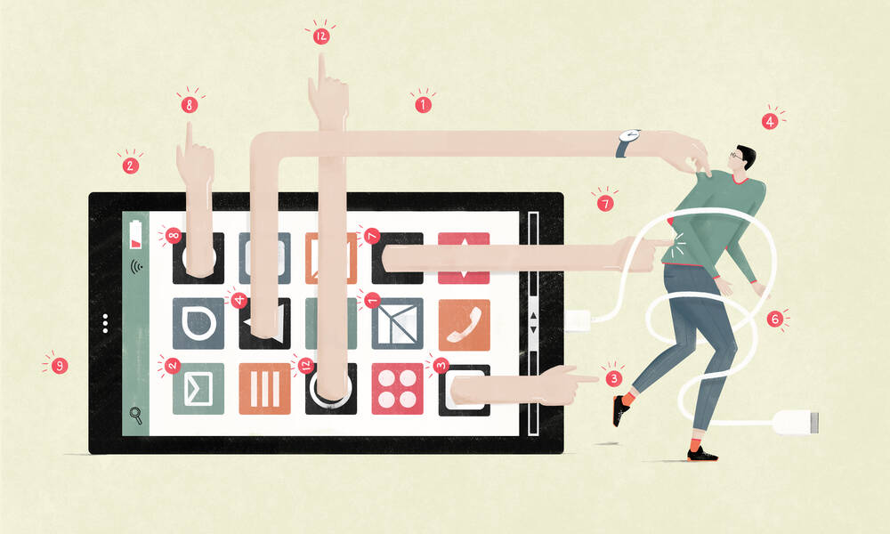
Recently, I made a realization that I’m probably not alone in: I have too many apps on my phone.
I’ve been using iPhones for so long (a full decade) that I have dozens of apps that seemed like a good idea many years ago but have sat unused for years since.
This glut of applications—games I haven’t played in ages, news apps that are no longer even in the App Store—is in part a problem with iOS, which makes it difficult to delete apps in bulk. (There is a way to remove unused apps, but it’s hidden in the settings in a somewhat obscure place and offers no user control over the process.)
This realization led me in a surprising direction this week: I bought an Android phone for the first time, which should do wonders on the clearing-the-slate front—or maybe not. We’ll have to see. (Old habits die hard.)
This sort of interface headache can be found in a lot of contexts, within many organizations, and can manifest itself in dangerous ways. Here’s an example: Let’s say your organization requires time sheets that are complex to fill out. That data may be useful, but it creates a whole lot of busywork.
A recent study argues that the problem is too many apps. In December, the software company Pegasystems revealed new research that looked at how business workers dig into applications on their desktops, and what it found was a surprisingly aggressive competition for their attention. Users switched among an average of 35 apps on a given day, representing 1,100 switches total. The organization, which sells a do-everything “digital transformation suite,” pushes for centralized “structured apps” that keep users within the same interface.
“Generally, managers and employees alike benefit from reducing the amount of switching between applications, as less switching means workers find what they need in the applications they use,” the study states [PDF].
This sounds great for IT departments looking to minimize tool sets, in part because of budgetary concerns. But color me skeptical on the diagnosis.
To make this point, I’d like to discuss the single most frustrating tool I use on a daily basis: the website for the stock photo service Getty Images. The pictures are great, of course, but the site has some major flaws, particularly when it comes to grabbing photo credits. I often have to physically select the text, then delete the information I don’t need, and finally reformat it.
Getty Images makes this extra difficult: You can quick-download an image from the main search interface, but the caption information is buried in a separate window. Additionally, if I want to select the text for that caption, I must use my cursor to select the whole caption and cannot rely on my keyboard, because if I use my arrow keys, it will navigate to the next image. Frustrating, right?
On top of all that, classifying why you downloaded the image in their system is harder than it should be, because there’s no way to create a list of presets—so you have to type the same thing in every single time.
There are so many minefields that I’ve had to invent my own system to automate the process, using two separate outside apps—the macOS utility Alfred, which allows me to load up key commands, and the text-formatting tool TextSoap, which allows me to quickly convert the unformatted caption info into a formatted photo credit. In this case, it’s a lot easier to use three apps that create an optimized workflow rather than relying on a single, frustrating tool.
Other tools have similar interface issues. If you’re forced to load up a new page in a web app just to change a small piece of information, or the tool doesn’t remember your settings, that creates productivity problems that your employees will be forced to work around.
And pushing users to minimize the number of tools they use comes with problems of its own. If you’re using a tool that tries to do everything for you, it inevitably won’t be as good at certain things as a dedicated tool might be. It also gives that monolithic tool no reason to work efficiently with outside apps, which limits opportunities for automation and other improvements. And finally, not everyone works the same way—and while a single tool can consider multiple use cases (see Airtable, which combines spreadsheet, database, and Trello-style “kanban board” interfaces), people have different work styles for a reason. They may find better luck with a tool of their own rather than the same tool everyone else uses.
Your association may not be able to convince a large-scale player like Getty Images to make interface changes (maybe a social media campaign would do the trick?), but you may have more control when it comes to your vendors. If you’re paying a company four figures or more to operate an app for you, you should have a say regarding these interface failings—because all that wasted time adds up. Sometimes, training is just a salve for bad design.
Going back to my iPhone’s app-glut problem, is the real issue that I have too many apps, or is it a failure of Apple’s user interface? I’d like to make the case for the latter. User interface problems waste people’s time and harm an organization’s efficiency—and it’s about time we become aware of how serious a problem it really is.
(Annemarie Gorissen/iStock/Getty Images Plus)
Ernie Smith is a former senior editor for Associations Now. MORE
Got an article tip for us? Contact us and let us know!


Comments