Why Associations Need to Adopt Responsive Design

For many folks, responsive design means mobile-friendly. But that’s not the whole story. Responsive design can be implemented across a variety of devices and offer easy reading and navigation with limited zooming, panning and scrolling.
According to Laura Taylor, director of online solutions at Naylor Association Solutions, “Associations invest a lot of time and resources into positioning themselves as the content leader in their industry. In order to ensure industry professionals see the association as their number one resource, it is imperative that associations deliver their content in a mobile-friendly format.”
- With the growth of mobile usage, it’s essential for your association to offer a website that is responsive.

- When your website is responsive, members can easily locate relevant information, regardless of their preferred device.
- Google has been favoring responsive websites since it recently updated its algorithm in March 2016.
- Mobile readers engage with emails longer than desktop readers do, with 67.1 percent of mobile readers spending longer than 10 seconds.
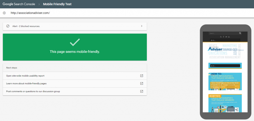
Do you know if your association’s website is responsive? Take the test here.
With the growth of mobile usage, over 41 percent according to the Informz Association Email Marketing Benchmark Report, it’s essential for your association to offer a website and emails that are responsive because more email is read on a mobile device than on a desktop. When your website is responsive, your members and potential members can easily locate relevant information, regardless of their preferred device (phone, tablet or desktop).
Benefits of responsive website design
Laura Taylor also mentions that “more than half of website visitors and newsletter recipients are viewing digital media on a mobile device, and that percentage is growing rapidly. If associations do not move to a responsive design for their website and newsletters, they are at risk of losing their audience and position in their industry.” By having a responsive website, your association can:
- Improve search rankings for your website. Google has been favoring responsive websites since it recently updated its algorithm in March. Google’s Jerry Dischler wrote a post for the AdWords blog last year, stating, “more Google searches take place on mobile devices than on computers in 10 countries including the US and Japan.” Responsive websites perform best in search rankings because they provide a better overall user experience than non-responsive sites.
- Keep a single URL. If you’re on the fence about whether or not your association needs a responsive website, there’s good news. You don’t need a separate URL for the mobile version of your website; even Google discourages using more than one. Plus, having a single URL will keep your workload lighter by allowing you to make changes to a single website instead of two separate websites, and then have it reflect across a wide variety of mobile devices and tablets.
- Increase mobile visits through social media. Does your association post frequently on social media? Social media is a great way to bring visitors back to your website. Think about how you check your social media accounts throughout the day; we assume it’s most likely through your mobile device. When your association’s website is responsive, people will be less likely to navigate away after clicking through to your website from a post that they found interesting via Facebook or Twitter.
- Generate the best user experience. Most importantly, responsive web design leads to a better user experience. When a potential member views your website via their mobile device and is seeking more information about membership, they need to not only be able to find it easily, but read and apply it to your association easily. No matter where your website visitors are, they should be able to access information on the go without having to go through the trouble of zooming in/out, panning and side scrolling. This will also eliminate high bounce rates and boost conversions when you cater to the needs of your audience and how they can receive information easily and efficiently.
What’s next? Responsive email design
The same report from Informz found that mobile readers engage with emails longer than desktop readers do, with 67.1 percent of mobile readers spending longer than 10 seconds with an email and more than 57 percent of emails being read on iPhones. Therefore, it’s not only important to have a responsive website, but responsive emails as well.
Similar to having a responsive website, responsive emails create a better user experience and prevent readers from immediately deleting the informative emails you’ve worked hard to create. What good is your content if readers can’t actually read it upon immediately opening your email? Think about the design elements of your responsive emails, including:
 Layout. When viewing emails on a mobile device, multiple column layouts tend to appear squished, busy and difficult to navigate. Stick to a single column layout so that your emails are compatible regardless of what device is being used. Since the mobile screen is small, using a single column layout cannot only simplify your design, but can highlight more important content as well.
- Fonts. It’s crucial to select a font and size that is clear and easy to read. Small font requires people to zoom in and side scroll, which isn’t ideal. You don’t want readers to have to do any extra work in order to read your email or else they’ll be likely to move on.
- Content. Your most important message should be conveyed “above the fold.” Let readers know first off what your email is going to be about beyond the subject line. People reading emails on mobile devices are likely to skim through and seek out images and any call-to-actions first, for example to watch a video or to download a report.
- Call-to-action. Make it easier for your readers to click on an item with hyperlinks or buttons. You’ll be more likely to convert a reader to become a member of your association by offering them a button that’s easy to click and take action.
- Images. Don’t go overboard with images in your emails to cater to mobile devices. Don’t lose readers with too many graphics and graphics that do not adjust to mobile devices well. For example, avoid using long banners in your emails as it can distort the overall format on mobile devices.
- Don’t forget to test your emails! As with any item you plan to send out to your membership, make sure you test, test and test again. Have a fresh set of eyes review your email and provide feedback on usability through multiple mobile devices and tablets.
A responsive website or email campaign is no longer a nice-to-have, but a necessity that can impact how visitors and readers interact and view your association. Offering your members and potential members a beautiful, optimized experience through their device of choice means you have expanded your reach of service and opportunity for increased engagement.
Is responsive design something you’ve already utilized? Are you planning to utilize it in the near future? Share your thoughts in the comments below!
